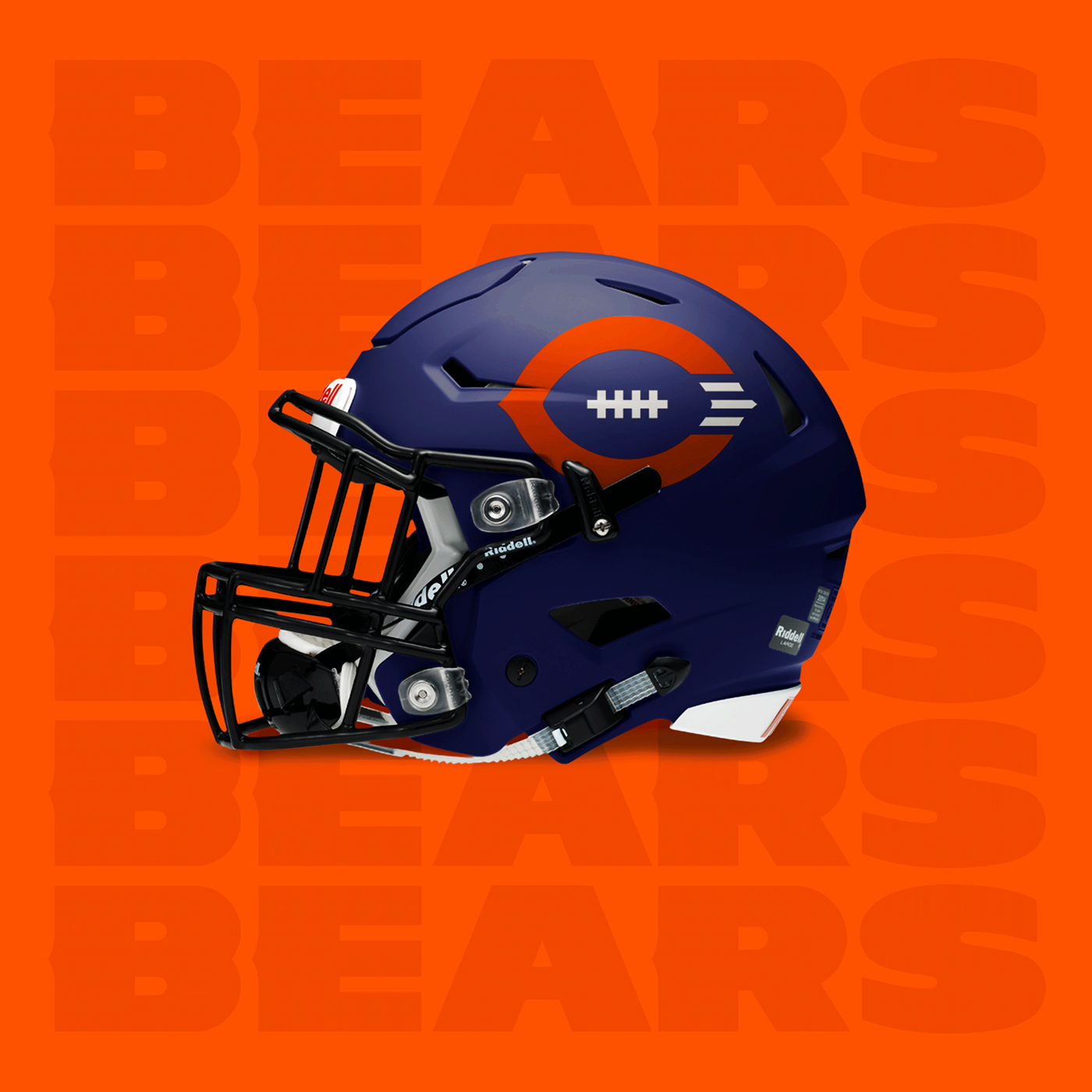
I was looking at the Chicago Bears logo recently and started picking out all of the flaws in the outdated design. The C is unbalanced. The C serves no conceptual purpose. The type lacks personality, so I decided to take a shot at fixing these problems. I added a football in the negative space of the C to give it purpose. I balanced the C and made it symmetrical. I took the iconic pinched tip of the C and applied it to the typography. I also redrew the bear-head from scratch. Before it looked like a friendly bear that would cuddle with the quarterback. Now it looks like a bear that would eat the opposing team for breakfast.